I started thinking about a visual representation of health some time ago. I come back to it from time to time and really need someone far more able graphically than me, to make it come to life. There’s nothing new about what goes into it and it won’t find an answer (like the bar model in maths teaching), more was meant as a clear visual way of understanding how we can influence out state of being.
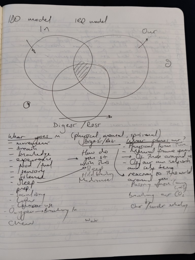
I started off thinking about what goes in (I), how we digest (D) and the output (O) and how these different elements interact with one another. This lent itself to a Venn diagram, with the key area that central space where all 3 areas complement one another and leaves this space equally balanced between all 3 areas. If one area begins to take precedence it grows, whilst the others stay the same or shrink, leaving that particular circle pulling away and squeeing the space in the middle. The key here, would be, keeping the space in the middle proportionally the same size, so if you spend time eating too much (In), how can you compensate for this in other areas (Out). If you over train (Out), how can you compensate for this (Digest / In).
Visually I can picture this as reflecting day to day changes and longer term patterns. I like the idea of building a computer program that you can plug in data that reflect a days experience and watch how the different circle move and what happens to the middle space.
Still more work to do on this, but a good starting point.
